
Easy GNOME
The default layout of GNOME should resemble Windows to ease use and provide for a better experience for users transitioning from Windows to Ubuntu.
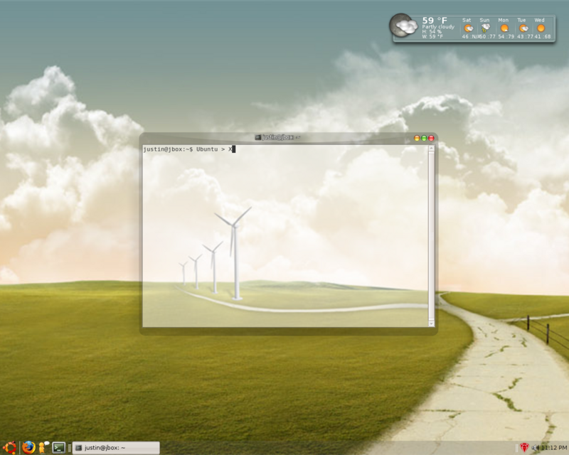
There should only be a single panel, orientation bottom, width 32, to include:
* "Main Menu", orientation left.
* Several commonly used App/Launcher Icons such as Firefox, Evolution Mail, and Gaim (similar to Windows Quick Launch toolbar)
* "Window Selector" (this one is a given)
* "Notification Area" (similar to system tray)
* "Clock", orientation far-right (no date, just time)
See example:
http://
Experienced users who prefer the current layout of GNOME can easily customize their desktop to meet their needs but we NEED to focus on the people who are not familiar with Ubuntu.
Blueprint information
- Status:
- Not started
- Approver:
- None
- Priority:
- Undefined
- Drafter:
- None
- Direction:
- Needs approval
- Assignee:
- None
- Definition:
- New
- Series goal:
- None
- Implementation:
-
Unknown
- Milestone target:
- None
- Started by
- Completed by
Related branches
Related bugs
Sprints
Whiteboard
Why does emulating Windows make things better? They are not the kings of usability you know.