
Folder View Widget.
Use a folder view widget as the default desktop icon handler
Blueprint information
- Status:
- Not started
- Approver:
- None
- Priority:
- Undefined
- Drafter:
- None
- Direction:
- Needs approval
- Assignee:
- None
- Definition:
- New
- Series goal:
- None
- Implementation:
-
Unknown
- Milestone target:
- None
- Started by
- Completed by
Related branches
Related bugs
Sprints
Whiteboard
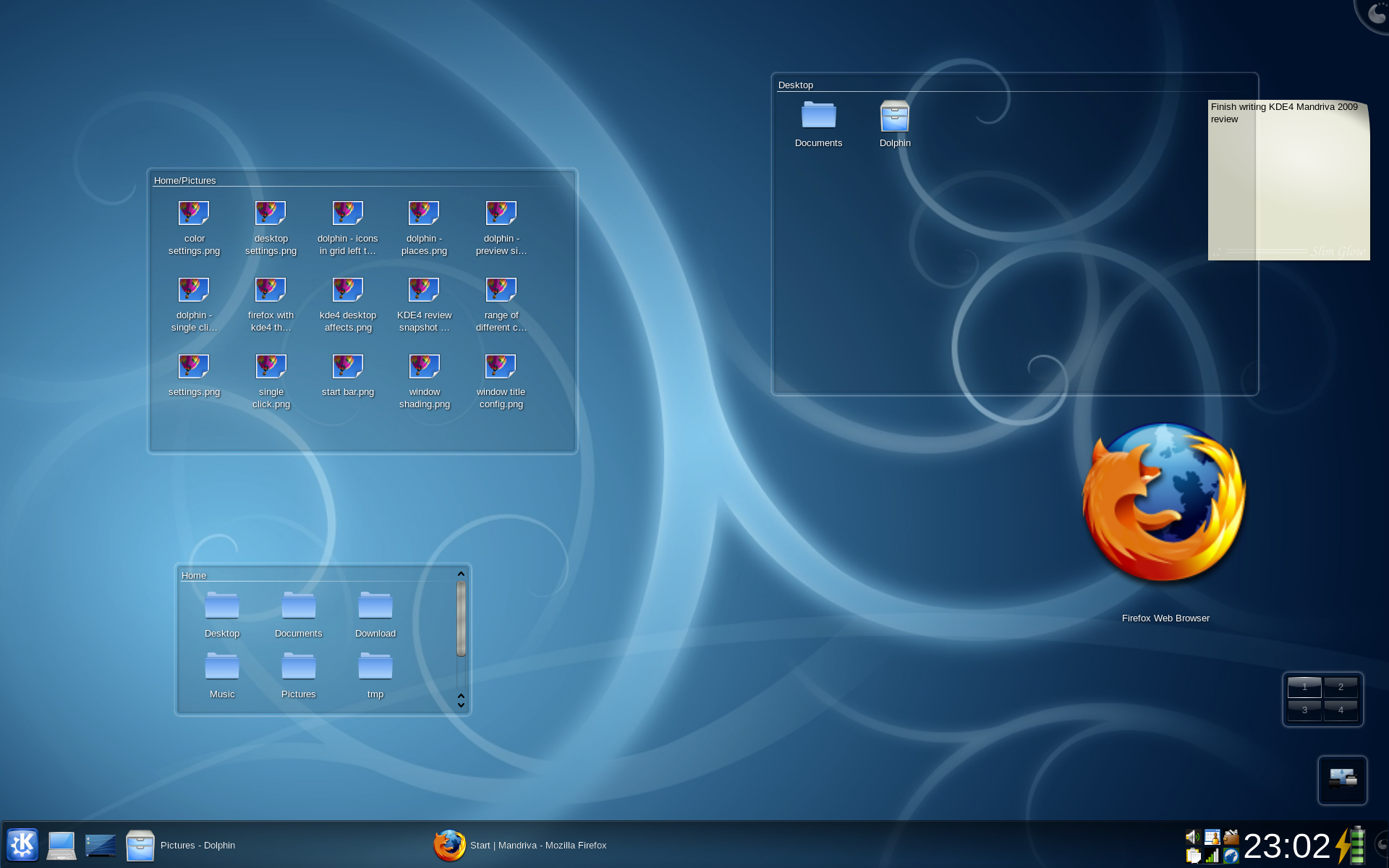
I think that the folder view as standard in the KDE 4.x series is awesome, but I think that their implementation of it is rather poor. The reason for this is that it looks like a weird window and not integrated as part of the desktop design.
So, many people, myself included, keep too much crap on the desktop and it gets difficult to sort things out. One solution that I've found is to use the 'text beside icon' option. This CLEARLY shows what an icon is as the readability of the title of that icon is much better. However, this does nothing to solve the problem of having too many things on the desktop.
This is where a better folder view widget comes into play. For examination, the KDE folder view widget: http://
You'll notice that they got several things wrong. First off, that sexy alpha-channeled box looks like a window, but not a window that looks like any other window that KDE has to offer. When I first tried to use it I though it was a window, but it didn't behave like a window and therefore was confusing for a little while.
Also, people by now expect their desktop icons to be situated in the upper left corner and flow top to bottom, left to right, unless you are a Mac user. This widget totally breaks that expectation.
So, I propose, should the Marlin project accept the idea of a built in widget layer, that the project uses a folder view widget as default that uses the following properties:
1) It's stuck to the desktop in the upper left corner where one would expect to find their icons. This can be moved by setting it to unstuck in a settings dialog.
2) It should always be frame-less.
3) Icons should, by default, be limited to one column. This can be altered in the settings.
4) By default, the icons should flow from top to bottom with 'text beside icon'. The text should be wrapped after 15 or so characters to a new line. The text line stack should be no taller than the icon. Icons with long file names that would run afoul of the previously stated should have the file name truncated when that icon is not hovered, and show the full file name when hovered. The icon flow and text flow should also be alterable in the settings.
5) If the number of icons exceed the space provided by the widget, then an aplha'd arrow the width of the widget should appear at the bottom. When the widget is hovered the arrow should loose opacity and a scrollbar should appear. As the widget is scrolled through, the upper arrow should appear and the bottom arrow should disappear when the bottom of the list is reached.
6) The widget should accept drag-n-drop to anywhere on the desktop, not just within the confines of the widget.
7) When a new file is dropped to the desktop the icon should 'grow' into place in the list. If the list is currently longer than the widget then the bottom arrow should glow/blink to signify that the drag-n-drop action has been accepted. It should continue to glow for several seconds or until user action has taken place.
8) By default, the home, computer, and if available, trash and network places icons should be pinned to the top of the list and not scrolled. This behavior can be changed in the settings.
9) The arrows should be smart enough to know if they are over a dark or light wallpaper.
Quick and dirty mock-ups here: http://