
Miller columns rethought
EDIT: here is an example demonstrating the current problem with the miller columns: https:/
I'd like to rethink how Miller columns are done (due to current lack of structure) in beatbox with a few ideas:
1) Miller columns like in marlin. in this scenario, we would start with genres-
2.) have the same setup as in marlin, but always show all 3 millers from the start (instead of opening as you go), and let the user choose where to start the milling (genre, artist, or album). still require that the user mill from left to right though. this solution isn't as graphically representable of the milling process, but gives the user more choices (where to start). since i'm guessing a majority of users do not fully maintain their song metadata, this option would probably be optimal to option 1.
note that options 1 and 2 use the miller on the side rather than on top. the song list will be cut to track #, title, and duration.
3.) keep the current set up with the millers on top, but structure them as they would be in idea 2. this means if you select an artist, you can only select another artist or an album. you can't go backwards and select a genre (unless you select "All Artists" to reset"). basically the same as 2, but less logical as the filters are on top and aren't as intuitive
4. work up some sort of mix between the miller columns, the album view, and the song list. something similar to what banshee has. maybe the genre and artist on top like they are now, and then on the bottom albums on left and songs on right. or get rid of the genre album and just do artist->album view->song list.
5. leave it how it is now. right now, it's a mess. the idea of letting the user start their filter at album and then go pick a genre, and then go pick an artist, and then a different album with NO structure is becoming a mess. nonetheless i'll keep it an option.
Blueprint information
- Status:
- Not started
- Approver:
- Scott Ringwelski
- Priority:
- Not
- Drafter:
- Scott Ringwelski
- Direction:
- Needs approval
- Assignee:
- Scott Ringwelski
- Definition:
- Discussion
- Series goal:
- None
- Implementation:
-
Unknown
- Milestone target:
- None
- Started by
- Completed by
Whiteboard
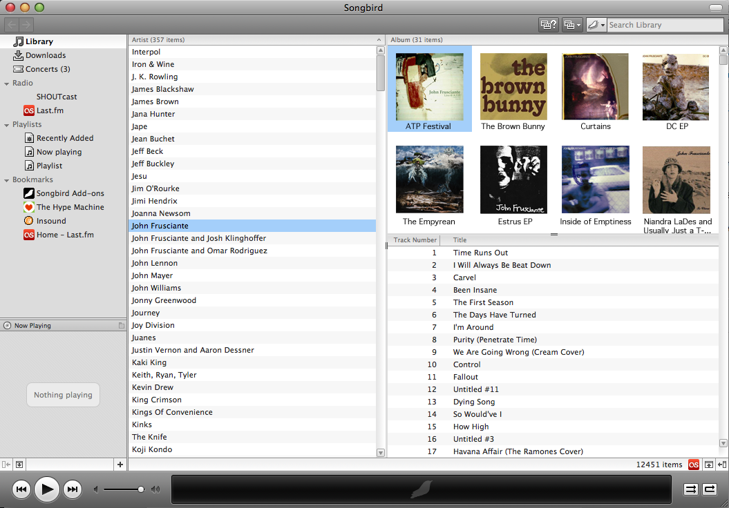
(Scott) I am currently going with either #2 or http://
(ak)
I think songs should have their own Miller column - the songs "menu"/list thing on the bottom really just duplicates the information you already know when you are navigating, ie artist and album. If you want an undifferentiated list (ie what you get before clicking a genre or artist) then there should be an undifferentiated list option in the views widget.
A good implementation of this is the Zune software: http://
I'll explain a little, although it may be best to just download it and play around a bit:
From the default (unsorted) screen you have basically 2 options for navigation and 3 to start playing:
Click an artist - all the artist's songs/albums are shown in their respective lists.
Click an album - the artist is selected and all the songs for that album are shown in the song COLUMN.
Double-click an artist - starts the first track of the first album, plays through all albums.
Double-click an album - starts that album, plays through it.
Double-click a song - plays that song, and then plays whatever is next in the song list. If an album is selected, it will just be that album. If an artist is selected it will be all of the artist's songs starting on that one.
These actions apply to any view, meaning if I select an artist, the same thing will happen if I double-click an album as if I was in unsorted view.
You also have the option to right-click any item (artist, album, or song) and enqueue it so it plays next. There are separate views for viewing the "now playing list" (aka the play queue) and managing playlists, which eliminates the need for the sidebar (which is hardly ever used anyways, but takes up a lot of space and is distracting).
All in all I think you could pick a few tricks from playing with the Zune software for a bit.
Thoughts?
(Scott)Zune player has a nice way of doing it (although it's really annoying that there is no "all artists" or "all albums" option. It is similar to my option 4. Really, it would involve combining the miller view and the album view into one view (to result in list view and "zune" view in the view selector). however, I think that a change this big for no important reason would not be smart.
(ak) So are you currently developing #2? I really like the idea of eliminating the 'genre' column, moving everything to the left, and adding a 'songs' column. Artist and album names are pretty short, really - three or four words, tops, so they could have smaller columns relative to the songs column, which includes track number, title, and duration, as you said. At the same time, each list would get maximum vertical space, which is really good for browsing the albums column in particular (which gets short shrift in Banshee or Rhythmbox, regardless of the fact that there are a) more albums than artists b) each album art square takes up 5 times as much space as a line of text).
(Scott)Yes, #2 is already implemented. If you'd like, go ahead and branch beatbox to develop your way and we can see what it's like (would mostly be just rearranging elements in the ui). For now i'm sticking with the current way.
(ak) I'll spend more time with the current UI and see how that goes first.